Companies waste thousands on ads, not because of poor targeting, but because of where they send the traffic.
If results aren’t meeting expectations, rather than investing more in ads or optimising your campaigns, take a moment to review what happens after the click.
Good ads bring in quality traffic. A good landing page turns it into results.
Get one wrong and neither works.
This article is here to help you fix the half most people ignore.
So, if you want to lower your costs, get more leads, and a leg up on the competition, keep reading.
How Much Can a Landing Page Actually Save You?
According to Unbounce, the difference between a high converting landing page and an average one can be close to 70%.
So, let’s say your current cost per lead is €50.
If you generate 10 leads a day and improve your conversion rate by 70%, here’s what you could save:
- Cost per lead: From €50 to €29.41
- Daily spend: From €500 to €294.10
- Daily savings: €205.90
- Monthly savings (30 days): €6,177
- Yearly savings: €75,285
That’s the power of a high-converting landing page.
While that may be a best case scenario, even a modest improvement can lead to thousands in savings over time.
So, if you want big savings and a better ROI, here’s what to avoid:
1. Your Website Is Not a Landing Page
A website is built for a broad audience coming from multiple channel sources (organic search, direct visits, referrals, etc.).
At that stage, user intent isn’t always clear, so your website is designed to help people explore and direct them to specific areas.
When someone clicks your ad, they’ve already shown intent. They’re looking for something specific. If you drop them onto a page with multiple service offerings, paths or distractions, you lose that momentum.
For example:
If you’re advertising boiler installation, but the page also promotes repairs, servicing and care plans, you’ve diluted the user’s intent. You’ve introduced doubt or hesitation, and that hesitation is often enough to cost you the lead.
And it’s not just the content. Navigation is another big distraction. Offering unnecessary blog links, menus or social icons only give users more ways to leave the page instead of directing them to the action you want.
The fix:
- Build campaign-specific landing pages tailored around your keywords and ads.
- One landing page per product, service or offer.
- Remove global navigation or unnecessary links.
- Keep the layout focused on one purpose and one conversion path.
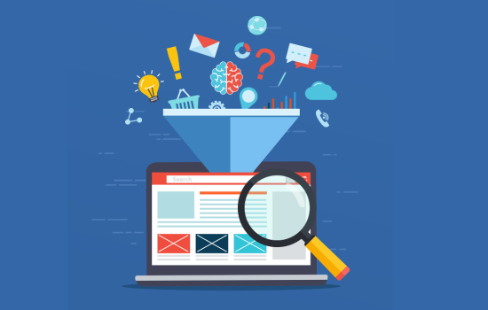
Your landing page (as a service-based business) is a funnel designed to capture contact details.
That’s it, nothing more.
2. Your Landing Page Has No Logical Path to Conversion
A lot of landing pages are built without a clear structure, cramming in every feature, detail, and selling point – just in case. The result? A cluttered page with no direction, no hierarchy and no clear path to capturing contact details.
A Smarter Way to Structure Your Landing Page
High-converting pages follow a clear, strategic flow. They speak to the customer’s problems, show empathy, offer a simple plan, and make it easy to take action. One framework I recommend is StoryBrand, created by Donald Miller, which goes something like this:
- Headline: Position the Customer as the Hero. Open with a clear, benefit-led headline that speaks to what they want to achieve, not what you offer.
- Identify the Problem: External, Internal & Philosophical.
- External: The surface-level issue (e.g. high energy bills).
- Internal: The feeling behind it (e.g. stress or uncertainty).
- Philosophical: The belief driving it (e.g. “I shouldn’t be overpaying for energy”).
Speak directly to the pain points. Don’t just describe the surface-level issue, tap into how it makes them feel.
- Present Yourself as the Guide: This is where you introduce your business, your experience.
- Outline the Plan: Give them a simple roadmap. What is the process from where they are now to where they want to be? Make action feel manageable and predictable.
- Add Proof: Use testimonials, reviews, certifications or data to support your claims.
Make it visual, skimmable and easy to trust. - CTA (Direct & Transitional): Don’t stop at “Get in Touch.” Offer something of value – something like “Free Instant Quote” or a “Personalised plan”.
But, what about users who aren’t quite ready to speak to someone? That’s where a low-commitment “Transitional CTA” comes in. Offer a free guide or a comparison checklist – something useful that lets you capture contact details without forcing immediate commitment. - The Stakes: Remind them why acting now matters. What happens if they delay?
3. Your Content Fails to Communicate Value
Is your landing page overcomplicated, filled with jargon and every idea that came to mind when you sat down to write it all those years ago?
Here’s how I tackle content:
- Start with the core message & Write it out. Don’t worry about structure, grammar, or even making sense. You don’t need to finish every sentence or clarify every idea. Just get the raw thoughts down.
- Use ChatGPT to review and improve. This helps clarify what you want to say, and highlights what doesn’t feel right.
- Repeat the process until you’ve got a draft that reflects your message and knowledge.
- Go through each sentence, and ask for multiple variations and pick the one that best communicates your message and tone.
- Finally, cut. Ask yourself: What sentence, phrase or word isn’t needed? Strip it back to the essentials.
The key? Revisions.
Simplicity = clarity. And clarity shows expertise.
So, don’t stop at the first draft. Even small changes – a sharper headline, a simpler sentence, a more specific benefit can make a huge difference in clarity, and more importantly, conversions.
4. Your Call-to-Action (CTA) Doesn’t Offer Value
Not giving users a clear reason or incentive to act could be costing you. A generic contact form or vague CTA creates uncertainty, and uncertainty kills the conversion.
Your call-to-action should answer one simple question:
What do I get if I submit my details?
Is there something your customer values that you can offer in return?
- An instant quote
- A personalised recommendation or plan
- A free guide or resource
Make your CTA incentive-driven. Tell users what they’ll receive, or what will happen next.
Even if you’re stuck with a simple CTA like “Get in Touch,” you can still boost clarity and create an incentive with supporting copy. For example: “We’ll get back to you within 1 business day with a custom quote or follow-up call.”
Your CTA doesn’t have to be clever or unique but it does need to be:
- Action-focused (starts with a verb): Get Started, Book Now, See Pricing
- Value-oriented (makes the benefit clear): Download Your Free Guide, Claim Your Offer, Get My Quote
- Visually prominent (easy to spot, strong contrast)
Your CTA is the tipping point, make it obvious, make it useful, and make it easy to say yes.
5. Your Contact Form Is Overcomplicated
Don’t fall at the final hurdle. The goal at this stage is simple: capture contact details. That’s it.
Too often, forms are overloaded with unnecessary fields, bad layouts or try to squeeze too much out of the user too soon.
Having additional information that you may use for marketing or more tailored follow-ups is no good if you don’t capture the contact details.
Contact form vs. lead form
- A contact form is basic: name, email, phone and message box. These work fine but tend to lack incentive and as result, have lower conversion rates.
- A lead form is structured to guide users through a few steps, lets you collect information in a non-overwhelming way and usually provides some value after the submission.
If you plan on building a lead form, try to minimize your to 4–5 questions.
Make the user feel like they’re getting something back, not just filling out a form.
But, keep it simple. Get the lead. The rest can come later.
6. Your Landing Page Lacks Visual Appeal
By now, you should have the essentials in place, good content, a clear offer and a value driven contact form. But if your page looks off, it will cost you.
A lot of landing pages aren’t “broken”, they just lack that final layer of polish. They feel rushed, templated, or visually dated.
And while design isn’t everything, first impressions matter. If your page feels clunky, confusing, or low quality, it can make people less confident in your brand.
What to do?
If you have an eye for design, use something like Canva, there’s even online templates to get you started.
For the rest of us, my recommendation: hire a designer. Platforms like 99Designs make it easy to get professional, conversion-focused design without a massive budget.
Here’s how to make the most of it:
- Provide real photos of your team, product or workspace, if possible. These build trust faster than any stock image ever could.
- If custom photos aren’t an option, choose stock images that support your content and ask the designer to personalise them by adding brand colours. Every image should support the message, not just fill space.
- Use icons to bring visual interest to dull or text-heavy sections without cluttering the design: Flaticon.com
A good designer will also help with the subtle things like colours, spacing, fonts that give your page that polished, trustworthy feel.
In Summary:
If you want to cut lead costs you can’t afford to overlook mistakes on your landing page – they could be costing you more than you think.
In many cases, a good landing page is the only way to competitively scale on ad platforms like Google. If your landing page outperforms your competitors’, it gives you an unfair advantage, you can bid more aggressively and show up more often.
So next time you’re creating campaigns, testing keywords or tweaking settings, don’t ignore what happens after the click.
Landing Page Mistake Checklist
Here’s a quick recap:
- Using Your Website as a Landing Page: Your homepage is built for exploration, not conversions. One page. One purpose. No distractions.
- No Logical Path to Conversion: Cramming in everything results in confusion. Structure your page with a clear, customer-focused flow.
- Content That Doesn’t Communicate Value: Overcomplicated copy filled with jargon will lose your audience. Edit, refine, and keep it simple.
- Call-to-Action That Lacks Incentive: “Get in Touch” isn’t enough. Make your CTA value-driven and action-focused.
- Overcomplicated Contact Forms: Don’t scare users off with long forms. Keep it short, simple, and focused on capturing the lead.
- Poor Visual Design: Your design doesn’t need to be fancy but it does need to be clean, clear, and credible.