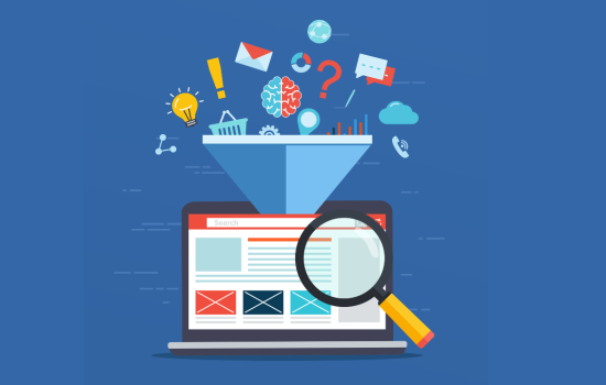
A well-designed, properly structured landing page can significantly reduce your lead cost, saving you thousands in marketing spend, yet most businesses spend heavily on ads without optimising where that traffic goes. The result? Low conversion rates and high lead costs.
In this guide, I’ll walk you through a practical process that we use to build high-performing landing pages from scratch so you can turn more clicks into qualified leads.
Step 1: Content First Approach
Before you think about layout, images, design – focus on the message you want to communicate and how that message will influence action.
Design, images and layout all play an important role, but they exist to support the content.
You could have the best-designed landing page in your industry but it won’t turn visitors into sales if the message is weak or the structure doesn’t guide people toward taking action.
If you haven’t already, check out our article: A 7-Step Framework to Writing Content That Converts.
It walks through the full 7-step framework we use to write copy for high-performing landing pages.
Step 2: Plan Your Landing Page Layout With a Simple Wireframe
A wireframe is a visual layout of your landing page. It outlines the structure and key elements like headings, buttons and content sections without any real design styling or branding.
Think of it like a blueprint. It shows where everything goes, not how it looks.
So, before you spend time or money on design, it’s a good idea to map out a rough layout of your landing page using the content you’ve just drafted.
This helps you:
- Visualise how the content will flow on the page
- Spot any layout or structure issues early
- Help Guide or communicate your design
It’ll save you time, money and hassle, and make sure the final product looks and works the way you intended.
Why It’s Worth Doing
- Clarifies layout and flow: It strips away distractions so you can focus on structure and usability before diving into visuals.
- Faster, cheaper iterations: It’s much quicker to update a wireframe than redesign a fully built page. Catching issues early saves you money.
- Helps shape your content: Seeing the layout on a page often reveals what’s too long, what could be simplified, or what could be restructured to better communicate your message.
- Keeps everyone aligned: Wireframes act as a shared reference point, making it easier to explain your vision to a designer.
Recommended Software: I recommend Moqups It’s fast, intuitive and comes with drag-and-drop components, built-in icons and free templates to help you get started quickly.
Your wireframe doesn’t need to be perfect, it just needs to show the basic structure of your content.
Step 3: Visual Assets
You might be tempted to jump straight into designing your page but before you do, take a moment to gather your images and visual assets.
Having these ready now will save you time, and help your final page feel more polished and intentional.
Types of visuals:
- Real Photos (team, workspace, your work, etc.)
This will vary by industry
If you run a hands-on business like carpet cleaning or solar installation, it should be relatively easy to gather photos of your work. For office-based services like finance or consultancy, you won’t need as many but aim for a good team photo at the very least to help build trust.
If you can hire a photographer, do it – it’s worth the investment. If not, most smartphones can take high-quality photos that work just fine. - Stock Images & Icons:
Find visuals that support your message and help break up long blocks of text. The goal isn’t just to fill space but to enhance clarity, improve readability and reinforce your brand.
Stock Images: work best for hands-on or visual services, for example, showing a home with solar panels, a clean driveway, or a technician at work.
Use them to provide context and help people picture the result you deliver.
Icons: For office-based or less visual industries (like consulting), icons are often a better fit as they are simple, distraction-free and easy to customise to match your brand.
They also help you avoid cliché stock photos (e.g. the classic business handshake or generic smiling receptionist).
Most landing pages benefit from a mix of both. Use visuals to guide the reader, create balance and highlight key points without stealing attention from your core message.
Recommended Resources:
- Pexels – Free high-quality stock photos
- Shutterstock – Premium stock images
- Flaticon – Free and paid icons, ideal for simple visuals
What About Video?
I won’t go into too much detail here as video deserves an article of its own.
When done well, video builds trust quickly and increases engagement and while it can absolutely boost conversion rates and help you stand out, it’s not essential to launch your landing page.
If you have a video, great. But, if not, don’t let it hold you back from launching your landing page.
Final Note: Balance is Key
You don’t want a page that’s overloaded with visuals but too much whitespace or content with no visual support can feel empty or untrustworthy.
Use images to guide the eye, break up content and reinforce your message. Not just to fill space.
Step 4: Design - Make it look nice, not just functional
Too often, businesses either hand over a pile of content and images to a developer with a quick brief, or jump straight into a website builder and start tweaking a template without a clear plan.
The result?
A website that’s functional, but bland, off-brand and visually forgettable.
The Fix? Don’t Start Building Without a Design
If you leave design decisions to your developer or rely entirely on a default template, you risk ending up with something that lacks polish, consistency or impact.
What to Do Instead:
Use resources like Envato or Page Builders like Unbounce to get ideas for layout and design elements.
Look for inspiration for your hero section, value blocks, CTAs and overall structure.
Then,
- Low-Cost Option: If you’ve got a good eye for design, use a tool like Canva to create your design mock-up. It’ll give you (or your developer) a clear visual direction when it comes to building the page.
- Recommended Option: If you have some budget to spare or design just isn’t your thing, hire a professional designer.
Platforms like 99Designs let you run a design contest, giving you a range of styles to choose from and is a great way to explore different ideas.
Why Design Matters
- Avoids unnecessary back-and-forth with developers
- Keeps your page on-brand and visually appealing
- Leads to a more trustworthy, high-converting final product
A clean, well-designed page not only looks better – it makes your business feel more trustworthy and established, which makes users more likely to convert.
Step 5: Choosing the Right Platform to Build your Landing Page
Ready to start building? Not quite.
Before you dive in, take a moment to consider which platform you’re going to use. I’ve seen too many businesses invest time and money into building pages, only to be locked into a platform that doesn’t support their needs.
My Recommended Platforms:
1. Unbounce
Unbounce is purpose-built for high-converting landing pages aligned with paid ad campaigns.
Pros:
- Built-in A/B testing and version control
- Fast page load speeds
- Simple editing for both desktop and mobile layouts
- Easy duplication of pages for campaign variations
Cons:
- Requires a paid subscription
2. WordPress
WordPress is the most flexible platform, better suited for building your main website however, it can be adapted for landing pages also.
Pros:
- More affordable
- Greater flexibility and control through plugins
Cons:
- More difficult to carry out A/B tests
Final Thoughts
We’ve had success with both platforms. Personally, I like to use Unbounce for all our landing pages because it’s faster to work with and makes A/B testing easy.
That said, if you’re already using WordPress and prefer to keep everything on one platform, there’s no reason you can’t build high-converting landing pages there too.
Side Note: If you’re considering platforms like Squarespace or Wix, make sure that they support Google Tag Manager or conversion tracking integration with Google Ads and GA4 as we’ve experienced issues with some of these platforms in the past.
Step 6. Development
Finally, your content is done, your design is ready and you’ve chosen your platform – now let’s bring it to life.
If You’re Working With a Developer:
This stage should be relatively straightforward. You’ve already done all the heavy lifting, now it’s simply a matter of your developer following the design and building what’s been outlined.
The clearer your design and instructions, the faster and smoother this step will be.
If You’re Building It Yourself:
How easy this is depends on your experience and comfort level with the platform you’re using.
The good news: both Unbounce and WordPress offer drag-and-drop builders, so even with limited experience, it’s definitely doable.
In either case, development should go much smoother now that you’re not switching between writing content, sourcing images, and adjusting layout as you go.
Final Checks Before You Go Live
Before publishing your page, do a final pass on both desktop and mobile:
- Forms and buttons working properly
- Layout and formatting responsive
- Page load speed is acceptable
- Conversion tracking set up (e.g. Google Tag Manager, GA4, Meta Pixel)
Once that’s done – you’re ready to launch.
Step 7: A/B Testing
Now that your page is live and leads are coming in, it’s time to optimise and see what can be improved as it’s unlikely that your first version is the best possible variation.
So keep improving through A/B testing. Small changes can lead to big gains over time.
Step 1: Make Sure Tracking Is in Place
If you want to improve something, you need to know where you’re starting.
Before running any tests, make sure tracking is properly set up.
I use Google Tag Manager to manage tracking for GA4, Google Ads, and Meta but whichever tools you use, just ensure tracking is reliable and accurate.
What to Track
Start with your primary conversions: Form submissions, pop-up completions, or any event where contact details are submitted.
Alongside that, track secondary actions: Anything that supports analysis and troubleshooting – things like CTA clicks, form starts, scroll depth and time on site. These give you context and help identify where users are engaging (or dropping off).
Step 2: What to Test
Here are some of the highest-impact elements to A/B test:
- Page Length: Test shorter, more direct pages vs longer pages with more information.
- Headlines & Subheadlines: Try different value propositions, location-based headlines that capture a local audience or maybe price-focused messaging.
- CTA Text or Style: Change the button copy (“Get a Quote” vs. “Instant Quote”), or try subtle effects like a pulsing animation to draw attention.
- Form Type: Compare inline lead forms, pop-ups and lead magnet opt-ins to see which performs best for your audience.
- Form Fields: More fields = better qualification. Fewer fields = higher volume. See what works best.
- Visual Elements: Button colour, hero images, background styles.
Don’t Test Too Much at Once
If you test too many things at once, you’ll lose track of what made a difference. Focus on one variable per test and give it enough time to collect meaningful data.
Small tweaks, tested consistently = big performance improvements over time.
Summary
Don’t treat your landing page as an afterthought.
By following the steps below, you can build a landing page that outperforms your competitors, reduces your lead costs, and improves your ROI.
Here’s a quick recap of the 7 steps:
- Content First
- Plan Your Layout With a Wireframe
- Gather the Right Visual Assets
- Design: Make It Look Good, Not Just Functional
- Choose the Right Platform
- Development
- A/B Test